HOLY Energy · May 2022 to November 2024
From social to cross-channel design.
I joined HOLY as a Graphic Design Intern, working mainly on paid and organic social. Three months later, I was offered a full-time role as a Performance Designer.
From there, the work kept expanding. I designed ads that had seconds to earn attention, emails that continued the campaign, landing-page assets that helped people decide, and print pieces that carried the idea off screen.
The role taught me that a strong brand should not look identical everywhere. It should know what to keep, what to change, and what each moment needs to do.
- Role
- Graphic Design Intern → Performance Designer
- Hands-on work
- Paid and organic social, CRM, e-commerce, and landing pages
- Creative range
- Print, animation, and selected campaign photoshoots
01
Finding more ways to show the product
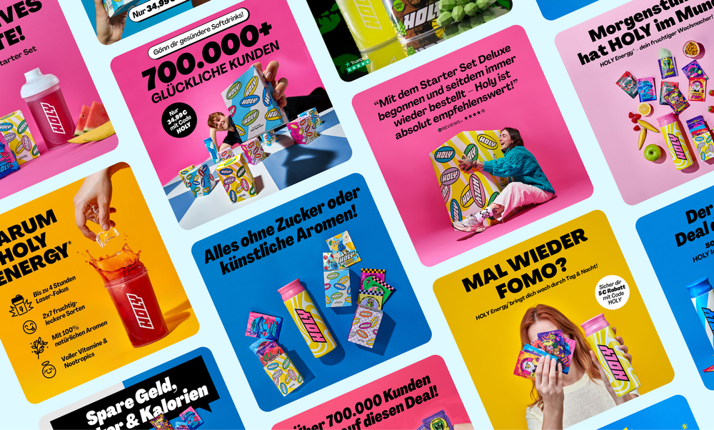
When I joined, much of the paid and organic creative relied on 3D product mockups. They were useful, but repeating the same approach left less room for different messages.
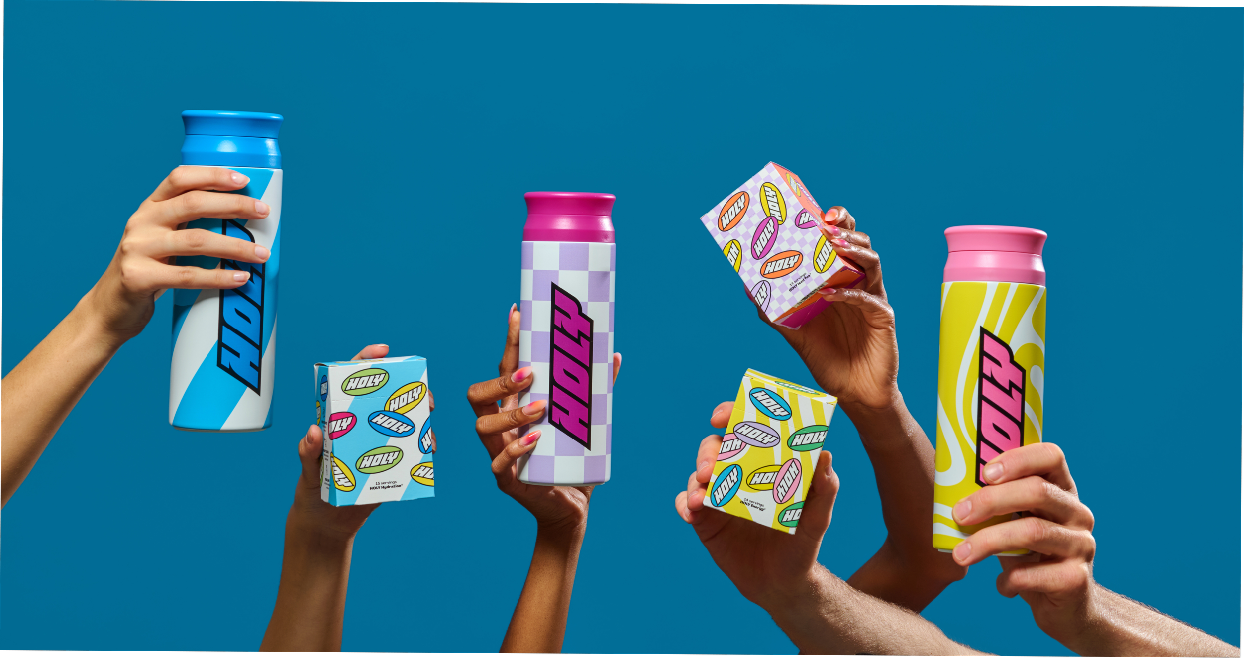
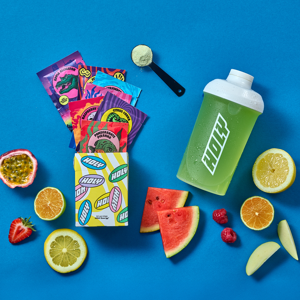
I began exploring a broader mix of graphic compositions, real-life photography, and short animations. The aim was not to make every asset look different. It was to find the right visual treatment for each message and give the Performance Marketing team more distinct directions to test.
02
Every channel needed its own rhythm.
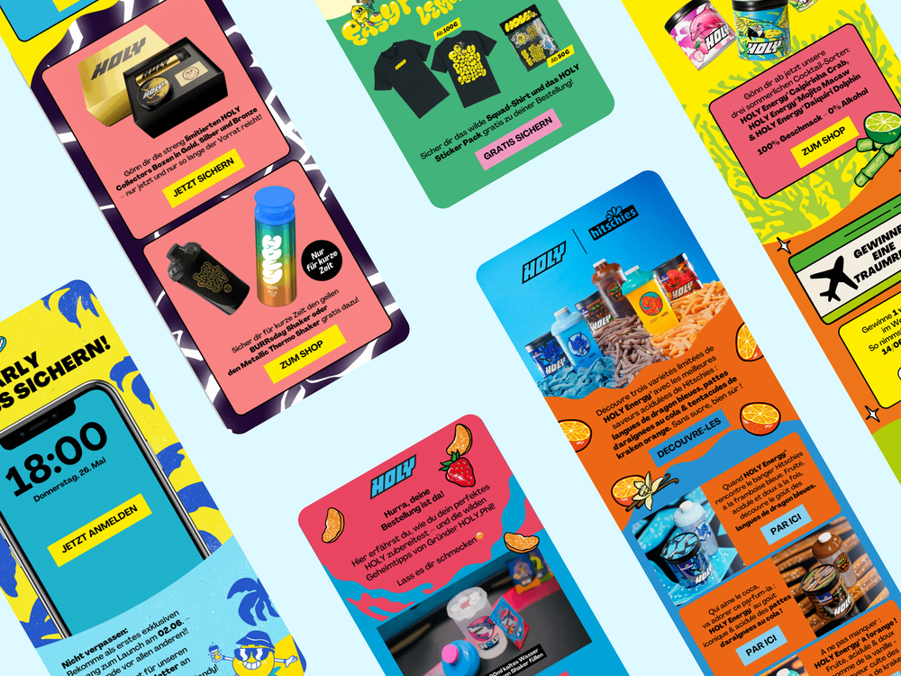
A paid ad, an email, and a landing page can belong to the same campaign, but they cannot do the same job.
The ad has seconds to earn attention. CRM has more room to develop the message. E-commerce needs to make the product easy to understand. Print has to carry the idea without motion or a click.
Working with Performance Marketing, CRM, and E-commerce, I adapted campaign work across these moments. The hierarchy, pace, and amount of information changed. The visual energy stayed.


03
Before the images reached the layout
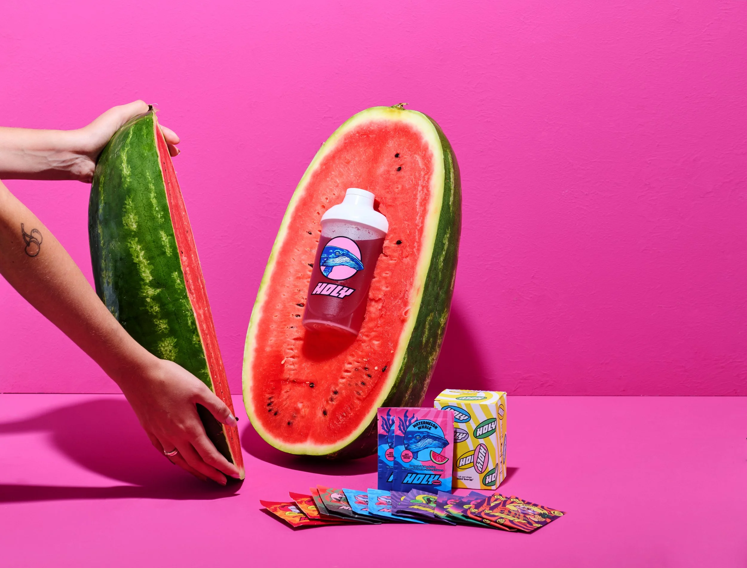
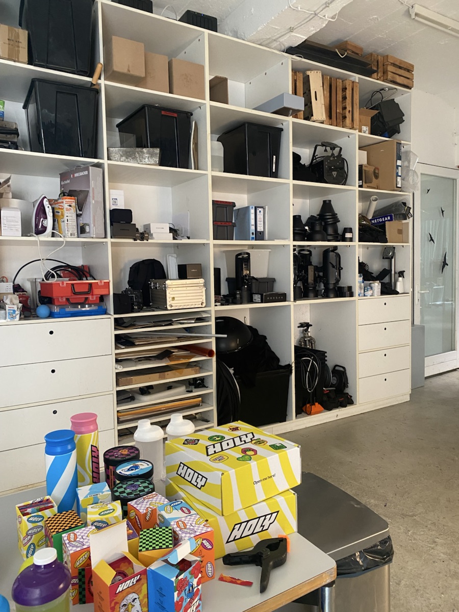
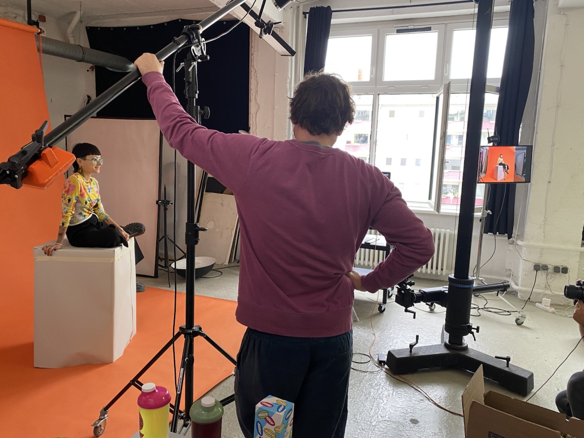
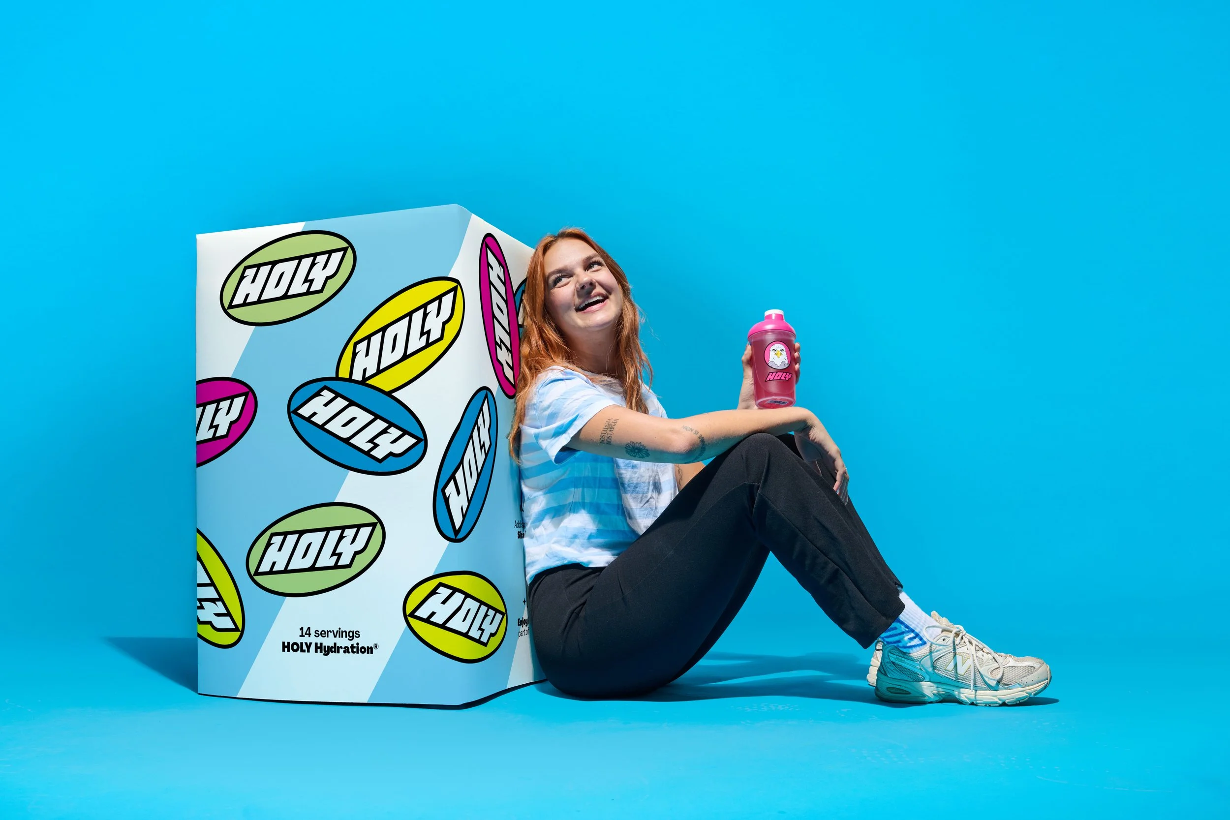
As my role grew, I helped initiate and art-direct selected campaign photoshoots with my manager.
We started with what the campaign needed, then considered the set, props, product groupings, composition, and where the imagery would eventually appear.
That changed my relationship with the work. I was no longer only adapting finished images. I could help shape the visual material the campaign would be built from.
04
Keeping HOLY recognisable across every channel.
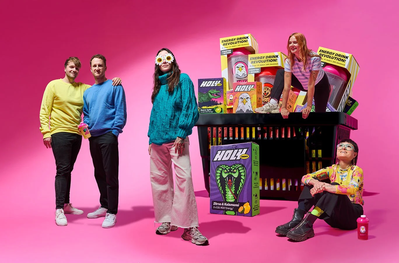
Paid social, organic social, CRM, e-commerce, landing pages, print, animation, and campaign photography all asked something different of the same brand.
Across more than two years, I went from learning HOLY's visual language to helping it work across more channels and formats.
Consistency is not repetition. It is knowing which parts of an idea can move and which parts need to stay.